HueNote is an audiovisual narrative that visually depicts a user's microphone input.
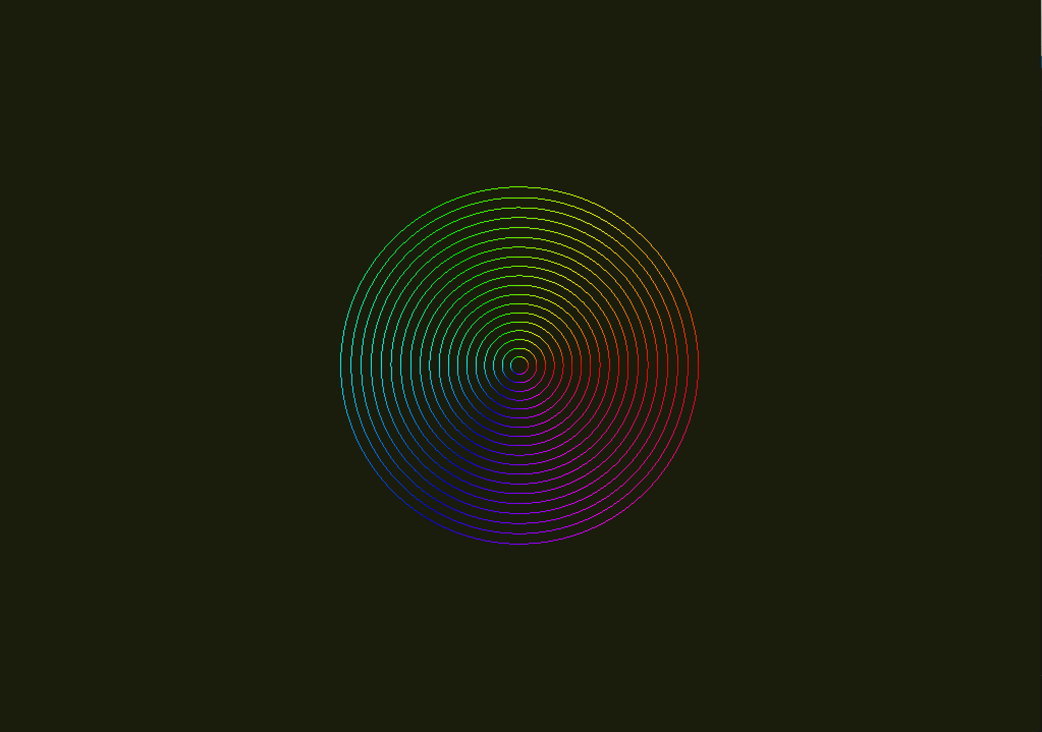
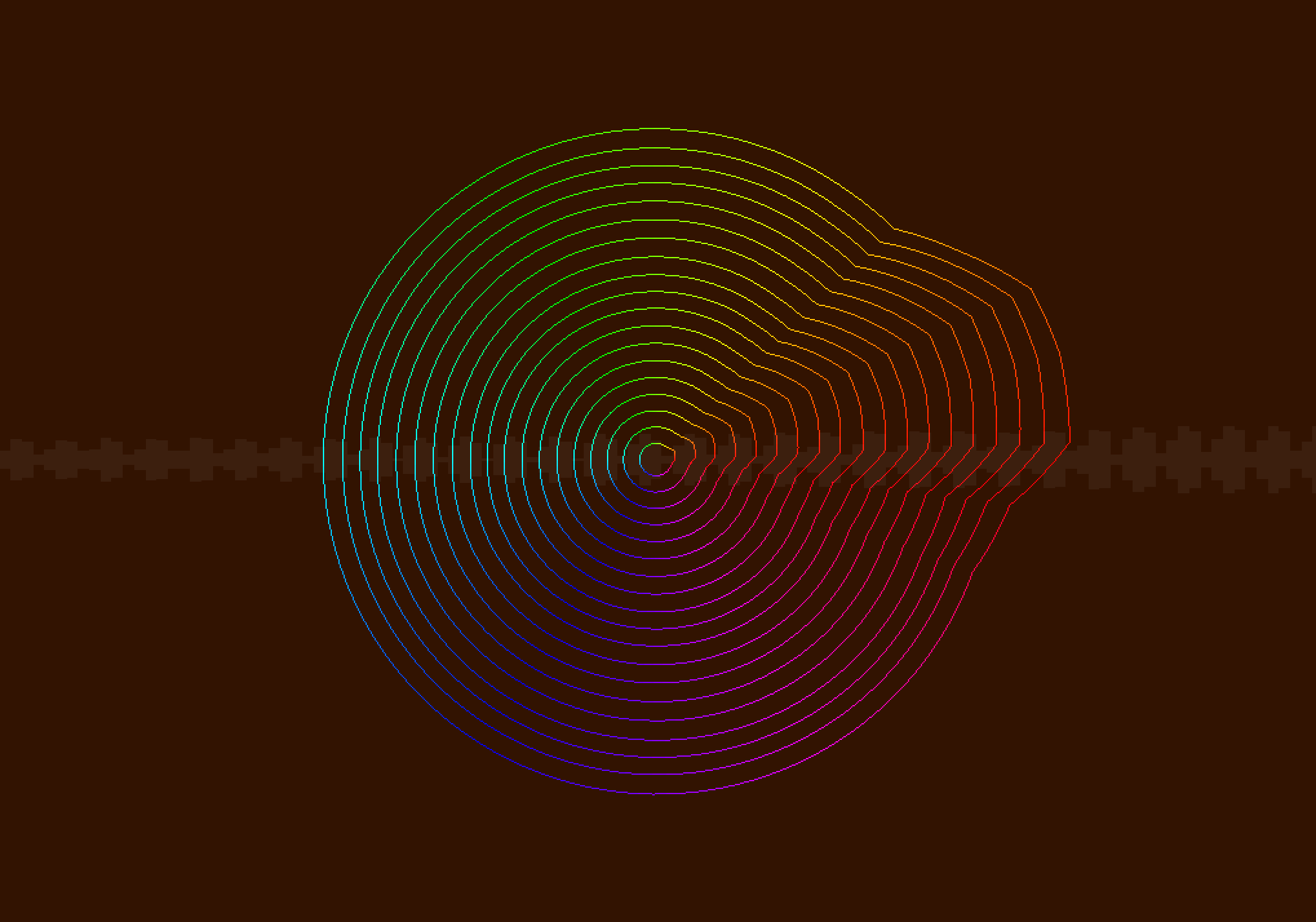
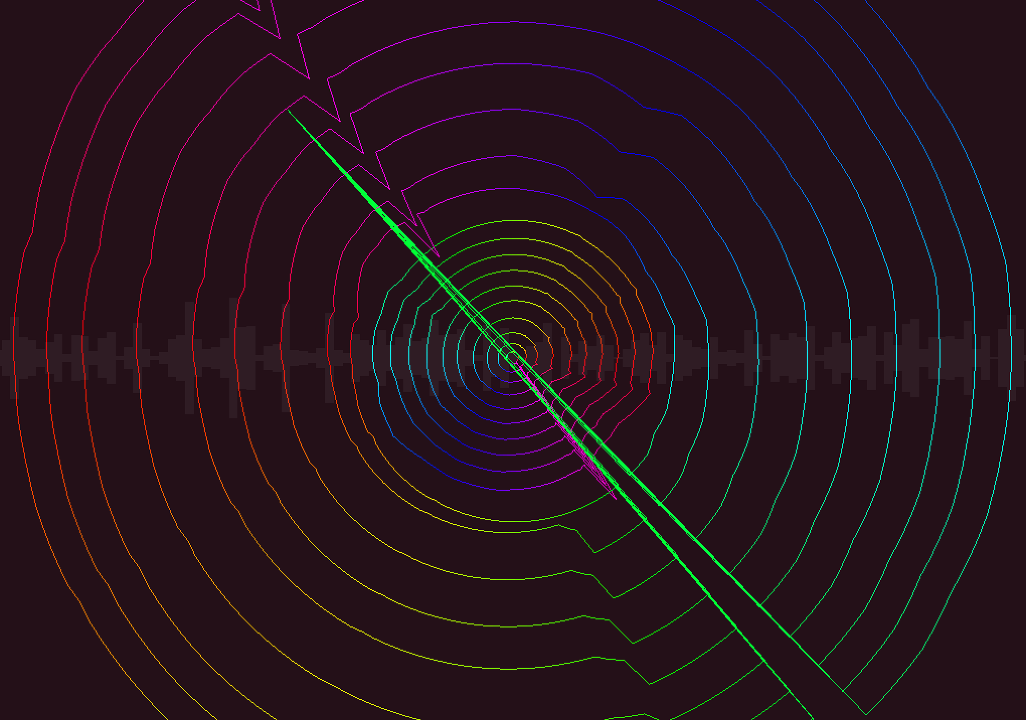
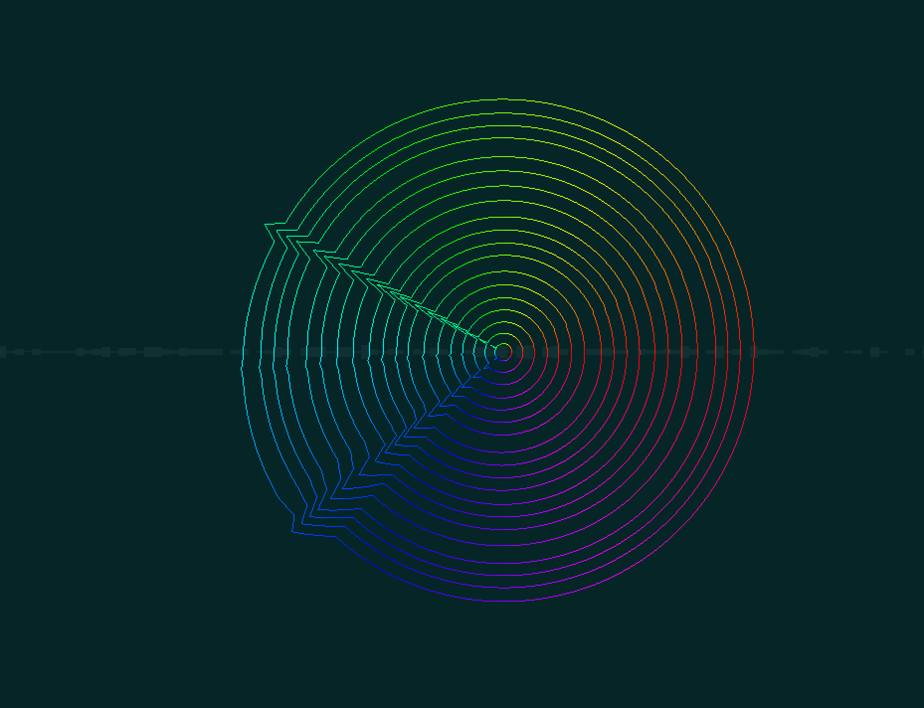
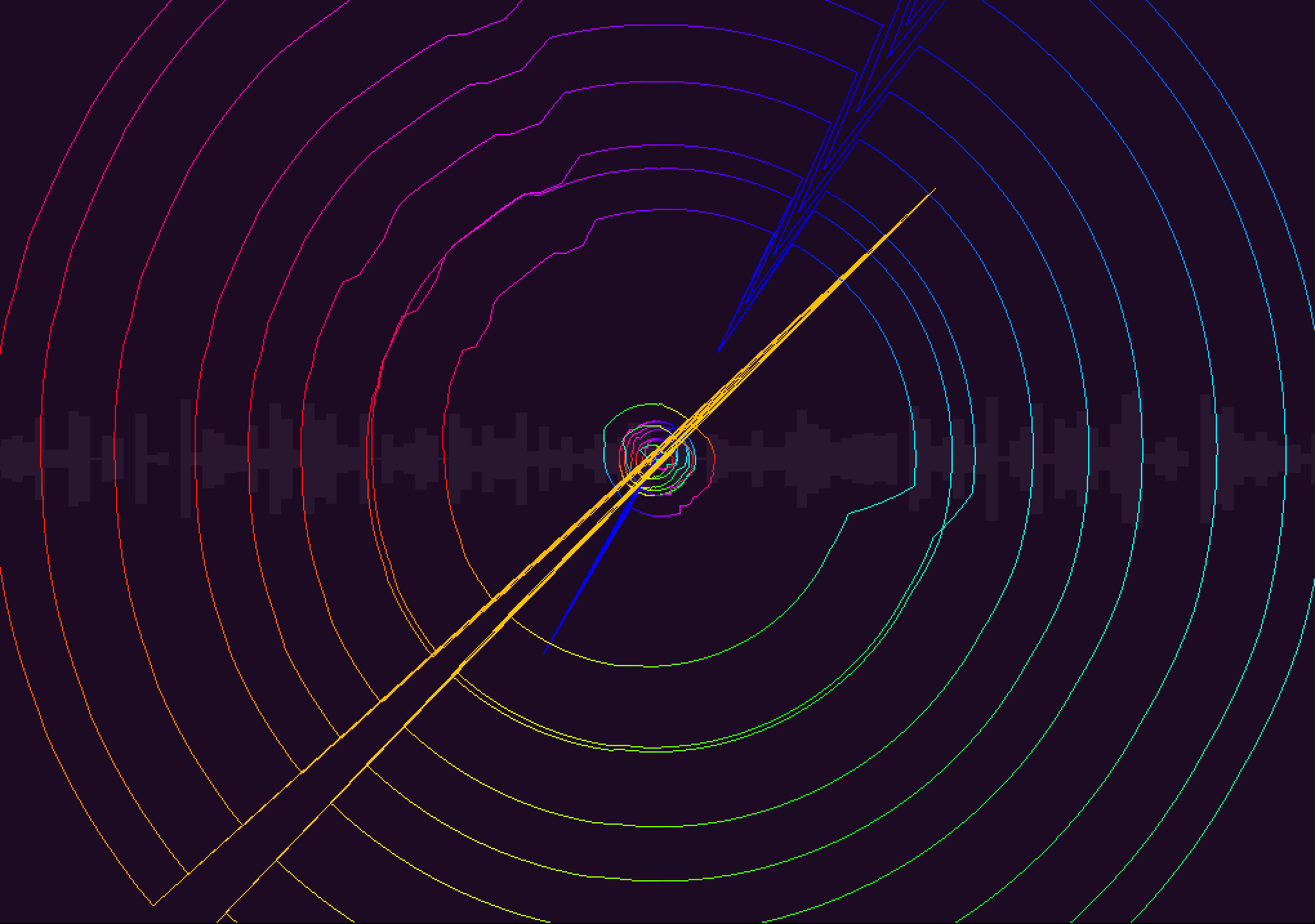
The program displays a raw signal as faded white rectangles and the FFT of the signal as a circle with peaks corresponding to the magnitude of that specific frequency after all frequencies have been collapsed into a single octave. The circles propogate outwards. The background color changes based on the predominant note.
The result is an immersive programmatic story that reacts fluidly to music, whistling, and experimentative noises.
Mac OS X App (tested on Sierra): HueNote (2 MB)
Building from source: Follow this link to download the huenote project.
From the root directory of the extracted huenote.zip file, run
to build for Mac OS X. To build for other systems, try substituting "make osx" with "make linux-alsa", "make linux-jack", "make linux-pulse", "make cygwin", or "make win32" — depending on the desired target.
In building this audiovisual experience, the notion of "note," or "pitch class," was important to me. Notes represent a fundamental building block in music theory but are not intuitive for computer programs to understand from raw audio.
To capture a simplified essence of what a note is computationally, I collapsed the frequency spectrum into a simple octave in logarithmic space, the same space in which humans interalize pitch.
It was difficult to visualize a line plot of these stacked pitches, as they changed rapidly and did not wrap around nicely. To fix this, I turned the line into a circle and radiated its history outwards so drastic changes could be visualized in real time.
To give the visualization a smooth and fluid feel, all changes happen with Zeno interpolation, that is a gradual percentage change increase towards a desired new state for every visual component every frame.
To improve pitch perception, I used a Hamming window with a large buffer size for the Fast Fourier Transform, which maps raw audio to frequencies and amplitudes and has sharper accuracy if more data is passed in. The raw signal is displayed with a shorter buffer size to show quick changes.
The jagged spiky arrows that soar across the visualization when music gets dramatic were unintentional, but it is the author's opinion that they look cool and add to the visual experience. They are the result of extremely high values in a particular frequency bin, which causes the jag in the circle to be so sharp that the circle no longer appears entirely connected.